My Dashboard
Welcome to My Dashboard, the Neptune® 360™ fully-configurable dashboard that enables you to customize the Key Performance Indicators (KPI![]() Key Performance Indicator. A metric against which you measure performance of a system or asset.) in one or more views. The views contain various panels that you arrange and define in the way you want to see the data within your water utility network. This dashboard provides the same data and level of detail as before, but now you determine how it is displayed.
Key Performance Indicator. A metric against which you measure performance of a system or asset.) in one or more views. The views contain various panels that you arrange and define in the way you want to see the data within your water utility network. This dashboard provides the same data and level of detail as before, but now you determine how it is displayed.
You can display key information such as system-wide consumption, active route status, gateway connectivity, reverse flow flags, and top meters by usage quickly monitor the health of your utility system. This data helps you identify issues before they become problems. For example, if the Active Route Status panel shows high incomplete or skipped meters, you know one or more routes need attention or a meter reader requires support. If Gateway Status shows a gateway offline, you can investigate communication failures that may affect meter reads. Sudden spikes in System Consumption or unusual readings in Top Meters by Consumption can signal irregular usage at specific customer locations. Reverse flow alerts can indicate plumbing issues or backflow concerns. By presenting this information in one place, the dashboard allows supervisors, billing staff, and field crews to make fast, informed decisions and respond to system issues in real time.
You can create multiple dashboard views for different purposes and with different data. You can add KPI panels that display graphs, text, and maps of data details and move the panels around on the screen.
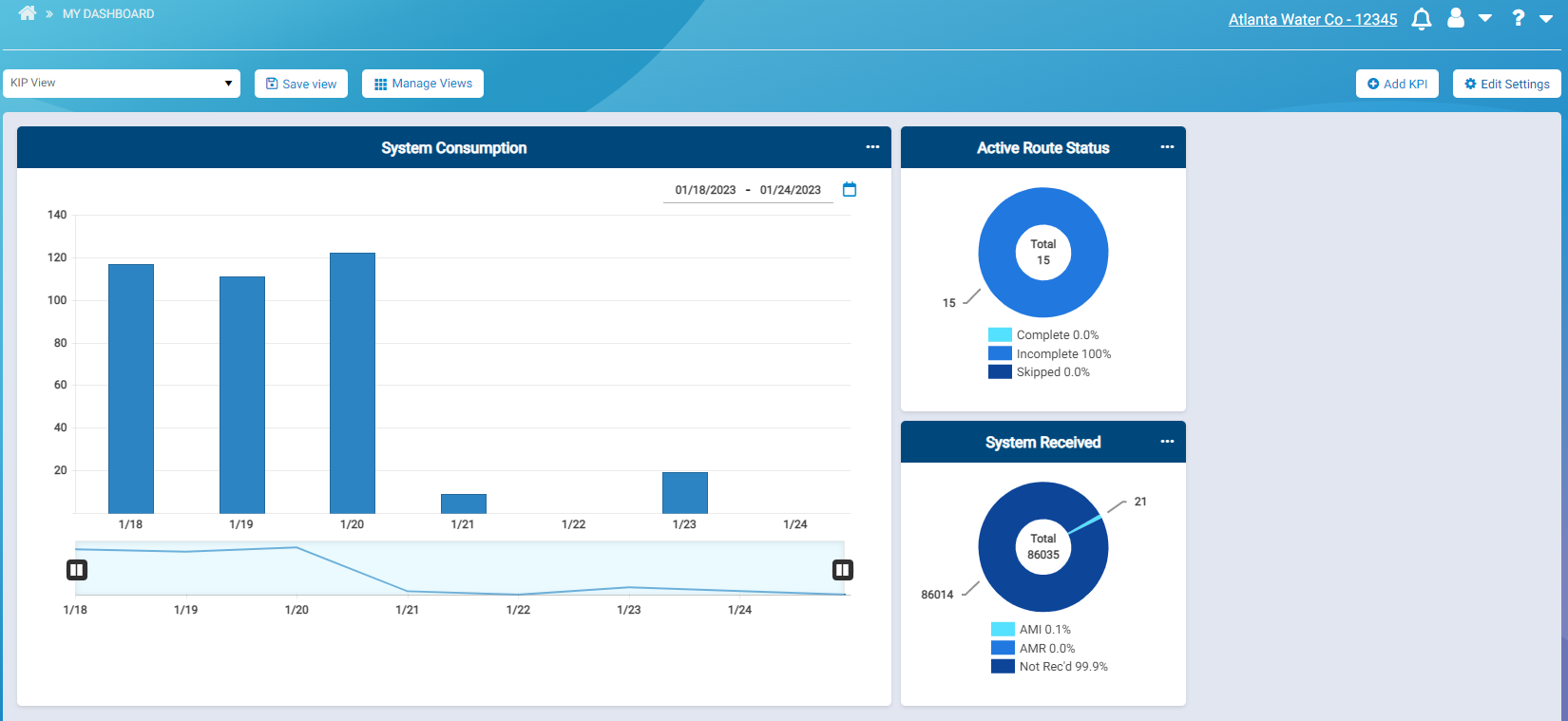
When you access My Dashboard for the first time before adding KPI panels, the default dashboard is displayed (for AMI![]() Advanced Metering Infrastructure. A system that captures, stores, and provides to the utility, at frequent intervals, detailed consumption and other information, such as usage, leak, and flow status, to support advanced applications. Reading the meters is automated through strategically placed gateways.), which shows:
Advanced Metering Infrastructure. A system that captures, stores, and provides to the utility, at frequent intervals, detailed consumption and other information, such as usage, leak, and flow status, to support advanced applications. Reading the meters is automated through strategically placed gateways.), which shows:
-
Daily system-wide consumption for the last seven days.
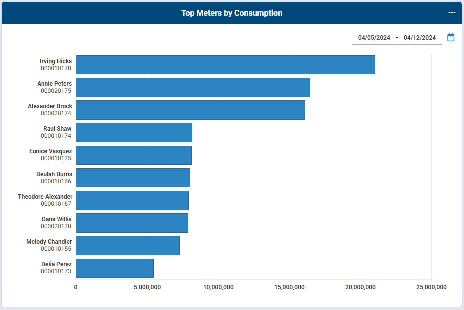
- The top meters by consumption.
- Active route status.
- System Received.
- Current Consumption.
- Reverse Flow.
- Gateway status.
There are two built-in dashboard views: Default Dashboard (for AMI) and Default Dashboard for AMR![]() Automated or Automatic Meter Reading. Readers read the meters manually using walk by or drive by reading equipment.. These built-in templates available are created by Neptune and you can copy them to create various views. You can also start with a blank canvas and create your own view from scratch.
Automated or Automatic Meter Reading. Readers read the meters manually using walk by or drive by reading equipment.. These built-in templates available are created by Neptune and you can copy them to create various views. You can also start with a blank canvas and create your own view from scratch.
The KPI panels that you can add to a view include:
-
Active Route Status – tracks the status of active routes in the system. Gives a count of Complete, Incomplete, and Skipped meters across selected open routes.
-
Current Consumption Flag – meters that have an active consumption flag in their latest reading, separated by severity type.
-
Gateway Status – tracks gateway online status. Online gateways show Normal while offline gateways are categorized by their last sync time and show either Warning or Critical.
-
Pressure – number of meters that registered pressure equal to, above, or below the defined threshold.
-
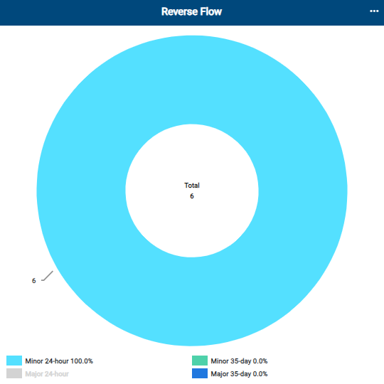
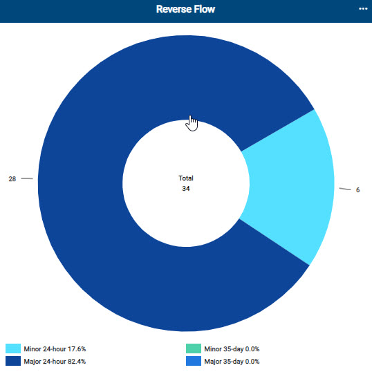
Reverse Flow – meters that have an active reverse flow flag in their latest reading.
-
System Consumption – system wide consumption data that can be configured to display at daily, monthly, or quarterly granularity.
-
System Received – breakout of the read method (AMI or AMR) by which the readings were captured.
-
Temperature – number of meters that registered temperature equal to, above, or below the defined threshold.
-
Top meters by consumption – Shows the top 10/20/30/40/50 meters registering the largest consumption over a period.

What You Can See and Do in This Window
Click a link to display the related information or step-by-step procedure.
| – | |
| – | |
| – | |
| – | |
| – | |
| – | |
| – | |
| – | |
| – | |
| – | |
| – | |
|
– |
|
|
– |
|
| – |
Select a View
When you first access My Dashboard, the Default Dashboard template is displayed. The system remembers the last View or Template you had selected and displays that on subsequent visits.
- On the Neptune 360 navigation panel, click My Dashboard.
- In the Default Dashboard field, click
 to display the list of views you can select.
 - Select the view you want to display in the dashboard.
You can now create new views and add KPI panels to the views.
Manage Views
Managing views includes creating , deleting, and renaming views. Views are specific to you and other users cannot see or access any view you create. You can create a view from a different view or from a template, or start with a blank template. Templates are controlled views that Neptune® creates and pushes to the dashboard for your use.
Create a New View
You can create a new view from an existing dashboard template or existing view, or create a fresh view using a blank template.
- On the Neptune 360 navigation panel, click My Dashboard.
- Click Manage Views to display the menu.
- Click Create New View.
- In the Choose a Template to Start From field, select the existing or blank template or view you want to use for the new view.
- In the Name Your New View field, type the name for the dashboard view.
- Click Save to save the new view.
- Add KPIs and edit the settings for the view as desired.
- Click Save View to save the view as a new and different view, or save the changes to the current view you are creating.
Save a View
You can save customized views and add them to the menu for selection.
- On the Neptune 360 navigation panel, click My Dashboard.
- Organize the panels on your dashboard in the way you want to see them.
- Click Save View.
- Do one of the following. If you are saving:
- A brand new view, type the name of the view and click Save as New.
- Changes to an existing view, click Save Changes.
- Changes to an existing view as a new view, click Save as New.
The view you save appears in the View menu that you can select and display at any time.
Delete a View
You can delete a dashboard view that you created. You can select multiple views to delete all at once. When you delete a view, it is deleted permanently and you must recreate it to make it available again.
- On the Neptune 360 navigation panel, click My Dashboard.
- Click Manage Views to display the menu.
- Click Delete Views.
- In the Delete Views window, click the box for each view you want to delete.
- Click Delete Views.
- In the Confirm Delete window, click Yes, Delete to delete the views.
The No, Go Back option redisplays the Delete Views window so you can select different views to delete.
Rename a View
You can rename any view that you created for your own dashboard.
- On the Neptune 360 navigation panel, click My Dashboard.
- Click Manage Views to display the menu.
- Click Rename Views.
- Next to the view you want to rename, click
 .
. - In the text box, type the new name for the view.
- Click
 to accept your name change.
 - Click OK to save the name change.
Add a KPI
You can add one or more KPIs to your dashboard display. You can add multiple panels of the same KPI, especially if you want to see the same information in different ways, such as Active Route status reflected as a donut graph, as points on a map, and as a text-based report, or see the same KPI filtered differently, such as the Active Route status filtered to different sets of routes. You can add a maximum of 21 KPI panels on a view.
- On the Neptune 360 navigation panel, click My Dashboard.
- In the drop-down list, select the view you want to display.
- Click
 to display the available KPIs to add.
- Click and drag the KPI panel you want to add and place it on your dashboard.
- Edit the settings for the KPI as desired.
Delete a KPI
You can delete a KPI from your dashboard at any time. You can add back any KPI you delete from the dashboard.
- On the Neptune 360 navigation panel, click My Dashboard.
- In the drop-down list, select the view you want to display.
- On the panel you want to delete, click the ellipsis (...) to display the context menu.
- Select
 .
. - Click
 to remove the KPI panel.
Edit KPI Settings
You can edit the settings for each KPI panel you have on your dashboard. The panel settings are specific to that exact KPI panel and does not affect other KPIs. If you have the same KPI in your view more than once, you configure each instance independently.
The KPI output types include:
Vertical and horizontal bar graphs (for system consumption and Top (number of) Meters by Consumption KPIs only) – 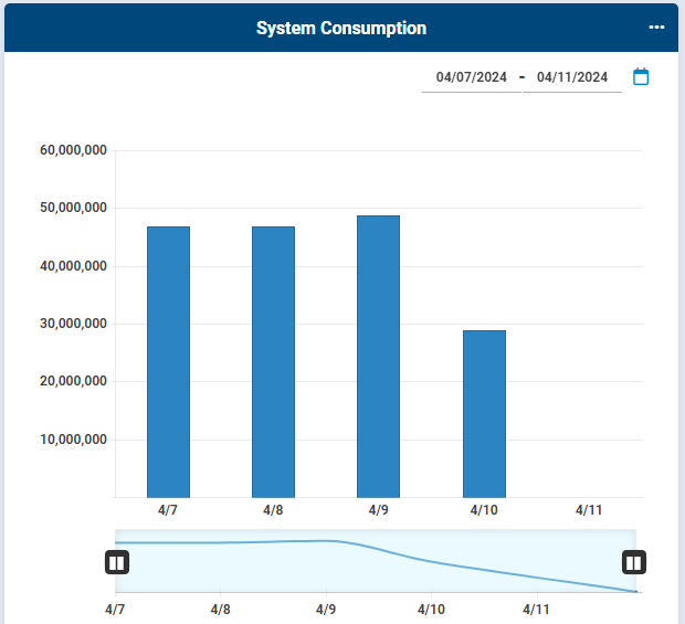
Detail reports – 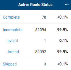
Terrain and street map – 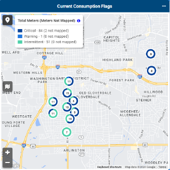
Donut graph – 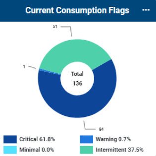
- On the Neptune 360 navigation panel, click My Dashboard.
- In the drop-down list, select the view you want to display.
- On the dashboard, click
 to display the settings by panel.
 - Select and type the settings for the panels you want to edit.
The following table defines the settings you can select and define.
- Click
 .
.
| Setting | KPI Used In | Description |
|---|---|---|
| Active Route Status data display options | Active Route Status |
The data points you want the KPI to display are
|
| Consumption |
|
Type of consumption, either actual or estimated, you want to the KPI to reflect. |
| Display Type |
|
Type of display for the top meters by consumption data:
|
|
Exclude Endpoints with Latest Read Older Than X Days |
|
Option to exclude from the KPI any endpoints for which the latest reading is older than the number of days you indicate, up to a maximum of 730 days (2 years). |
| For Last x Days; Show the Last / Show Last X Days of Data |
|
Number of inclusive days for which to show consumption data. For example, you can show top meter consumption for up to 730 days prior to the current day. |
|
Gateway Pins |
|
Option to enable displaying pins for gateways when you view the KPI data in map mode. |
| Group Filter |
|
Endpoint groups you want to either include in or exclude from the consumption data. Select the radio button to include or exclude groups, and then choose the groups to which you want your selection to apply. |
| MIU (endpoint) Status |
|
Option to include only active endpoints or all endpoints in the KPI. The Include option shows ONLY the endpoints in the selected groups. The Exclude option shows all endpoints in the system EXCEPT the ones in the selected groups. |
| Read By | Reverse Flow |
The meter reading method you want the KPI to capture:
|
| Reverse Flow Data Display Options | Reverse Flow |
Options for displaying reverse flow events in the KPI are:
|
| Route Filter |
|
Routes you want to include in the consumption data. You can include all routes or only selected routes. |
| Route Selector | Active Route Status | Option to enable the selection of routes to show or hide on the KPI. For example, you can show the Route Selector and select different routes to change the KPI data. |
| Set View | System Consumption | View for the consumption data. The view can be daily, monthly, or quarterly. |
| Split by 24 hour / 35 day | Reverse Flow | Option to enable or disable the KPI to be split between 24 hour flags and 35 day flags. This is useful when some customer meters are not read every day, such as with some AMR meters. In general, AMI meters are read every day and so the flags are enabled for 24 hours. |
| Status (general reading issues or flags) |
|
The statuses you want to include in the KPI:
|
| System Received Method | System Received |
The methods by which meters are read that you want to include in the System Received KPI:
|
| Threshold |
|
The readings for endpoints that fall above or below the defined pressure or temperature threshold, or that fall within normal range. |
| Top Meters to Show | Top Meters by Consumption | Number of meters to show by top consumption, between 10 and 50 meters. |
Edit a KPI Panel Title
You can edit the title of any panel in your dashboard.
- On the Neptune 360 navigation panel, click My Dashboard.
- In the drop-down list, select the view you want to display.
- On the dashboard, click to display the settings by panel.
- On the panel for which you want to change the title, click
 .
. - Overwrite the old title with the new title.
- Click
 to save the new title.
Hide and Show Data on a Donut Graph
You can hide and show one or more pieces of data in a donut graph. The dashboard shows all data by default.
- On the Neptune 360 navigation panel, click My Dashboard.
- On the dashboard, click to display the settings by panel.
- On the panel for which you want to hide or show data, click .
- On the donut graph, click the key for the data you want to hide on the graph.
- Click the key for the data again to redisplay the data on the graph.
- Hover over any color in the graph to display the related text key for the color.
Organize the KPI Panels
You can arrange and rearrange all the panels on the dashboard, resize them, and display detailed data from graphs that display in the initial view. The detailed data displays as a grid report in a separate tab.
Move a Panel
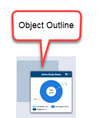
You can move any panel to a different location on the dashboard to arrange the current view in the way you want to see the dashboard data. When you move a panel, the system shows an object outline where you can place the panel and the panel snaps into the object outline for placement when you release it.
- Click and drag the panel from one location to another on the page and release the panel so it snaps into the object outline.

Expand the Panel View
You can expand the panel view so the panel is bigger and takes up more space on the page.
- On the Neptune 360 navigation panel, click My Dashboard.
- In the drop-down list, select the view you want to display.
- In any panel, hover near the ellipses in the panel header to reveal the expand panel button (
 ) .
) . - Click the button to expand the size of the panel.
After you click the button, it changes to the Reset button (  ) .
) .
- Click to reset the panel back to its original size.
Change the Date Range
You can change the date range for a selected graph on the dashboard.
- On the Neptune 360 navigation panel, click My Dashboard.
- In the drop-down list, select the view you want to display.
- On the panel for which you want to change the title, click .
- Click anywhere on a date currently displayed, or click
 .
. - Click the first and last dates of the new date range. You can scroll through the calendar months, or click the date range in the calendar header to display the years and months to select the new date range.
 left and right to change the date range and the resulting data in the KPI.
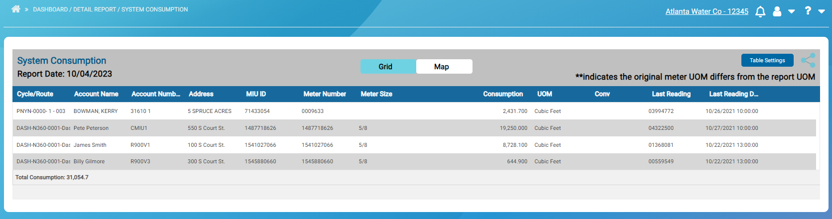
View the Detail Report
You can show the detail report for any graph on the dashboard. For example, you can show the detail report for each KPI on the dashboard.
- On the Neptune 360 navigation panel, click My Dashboard.
- In the drop-down list, select the view you want to display.
- On the specific KPI panel, click View Detail Report.
- The detail report is displayed on a separate page.
You can click a donut slice on the donut view or a text data point on the text view to drill down into the detail report. The detail report contains only the meters in the type/category/donut slice or text view. You can customize the report view and export the report to other formats as desired.
Display Detail for Single Graph Reading
You can display the detail report for a single reading in a bar graph.
- On the Neptune 360 navigation panel, click My Dashboard.
- In the drop-down list, select the view you want to display.
- On any bar graph, hover over a bar until the pointing index finger icon is displayed (
 ).
).
The icon format may be different from the one displayed here, based on your browser.
- Click the bar to display the details in a separate grid.
Some reports, such as Gateways Status, include links to drill-down data that you can click to display individual endpoint account and reading information. The drill-down links display as highlighted and underlined data.
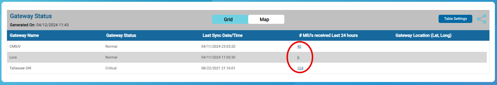
- To display the data on the Customer Inquiry page, scroll to the last column on the grid and click
 in the data row you want to display on the Customer Inquiry page.
| Field | Description |
|---|---|
| Account Number (#) | Account number associated with the endpoint. |
| Account Name | Customer name on the account. |
| Address / Premises Address | Short version of the customer address associated with the account. Includes address lines 1 and 2. |
| Consumption | Total volume of consumption (by hour or by day) for the meter / endpoint. Applies to both active and inactive endpoints. |
| Conv | UOM |
| Cycle / Route |
|
| Last Reading | Most recent meter reading. Depending on the report, this may be the last invalid reading. |
|
Last Reading DateTime |
Date and time of the last meter reading. Depending on the report, this may be the last invalid reading. |
| Meter Number | Meter ID to which the report data applies. |
| Meter Size | Diameter of the meter (in inches). |
| MIU ID | Endpoint ID to which the report data applies. |
| Note | Any notes related to the reading. |
| Pressure | The current pressure of meters that have the capability to track pressure. Pressure displays in the UOM defined for the endpoint (pounds per square inch or kilopascals). |
| Read Method |
The method by which the system reads endpoints. The column displays:
|
| Read Sequence | Meter read order determined by the billing system. |
| Received By | List of gateways that have heard the endpoint within the report date range. A count of the times each gateway has heard the endpoint within the report date range appears in parentheses. The list is sorted by count of times heard, in descending order as the default. |
| Temperature | The current temperature of meters that have the capability to track temperature. Temperature displays in the UOM defined for the endpoint (Celsius or Fahrenheit). |
| Threshold | The defined minimum and maximum thresholds for the pressure and temperature for each endpoint, expressed in the UOM for each endpoint. |
| Threshold Status |
|
| UOM |
Unit of measure for the water consumption:
|
You can customize your view of the report grid and display column details on the Customer Inquiry page. Note that the data in many panels link to details. See Customize a Report Grid in the following section for more information.
Customize a Report Grid
After you run a report, apply the following options to customize the report grid.
| To... | Complete These Steps |
|---|---|
| Export the report details to a PDF or Excel file, |
Click |
| Sort data in a column in either ascending or descending order, | Next to the column header, click  and then select the desired sort order. and then select the desired sort order. |
| Customize the columns that appear in the report, |
|
| Change the placement of a column in the grid, | Click and drag the column heading to the new location on the grid. |
| Access the Customer Inquiry page for more details on the column data, | If available for the report, click in the column for which you want more detail to display the detail on the Customer Inquiry page. |
| View the map of a detail report grid | If your utility is connected to geocoding, you can view the map of readings in the report grid. Click Map to display the readings on a map. See Map for the display options of the map view. |
 to display the export options, and then select the desired option. You can print and save the PDF or Excel file.
Narrow Down the Display View
You can customize the graph view within the date range to narrow down the data displayed in the graph.
- On the Neptune 360 navigation panel, click My Dashboard.
- In the drop-down list, select the view you want to display.
- On the panel for the graph you want to work with, move the slide bars (
 ) left and right to show more or fewer dates and related consumption data in the graph.
The graph data and view shifts each time you move the slide bars.
View and Navigate the Grid Map
If your utility is connected to geocoding or has provided meter GPS coordinates in the import file, you can view a map of all the readings on a grid panel, not just of one specific reading on the grid.
- On the Neptune 360 navigation panel, click My Dashboard.
- In the drop-down list, select the view you want to display.
- On the panel you want to work with, click the ellipsis (... ) to display the context menu.
- Click View Map.
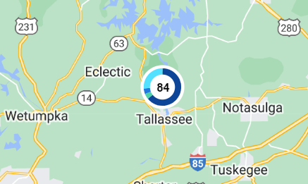
The map displays data as pinpoints in various locations on the map. You can change the map view, zoom in and zoom out, and display the details of specific pinpoints on the map.
Change the Map to Satellite View
You can view the map as a terrain view or as a satellite view. The terrain view is the default view.
- On the Neptune 360 navigation panel, click My Dashboard.
- In the drop-down list, select the view you want to display.
- On the map, click the map view button
 .
. - Click Satellite to display the satellite view for the map.
- Click Map to redisplay the terrain view for the map.
Move the Map
- On the Neptune 360 navigation panel, click My Dashboard.
- In the drop-down list, select the view you want to display.
- Click and drag the map to show areas north, south, east, and west of the current view.
Zoom In and Out on the Map
You can zoom the map in and out to display a more focused area or a wider area.
- On the Neptune 360 navigation panel, click My Dashboard.
- In the drop-down list, select the view you want to display.
- Click the plus sign
 to zoom in on the map.
 - Click the minus sign
 to zoom out on the map.
Display Pinpoint Data
The pinpoints on a map display the specific meters in an area that correspond to the data on the graph. There may be many endpoints concentrated in an area that display as a cluster on the map. The cluster shows the total number of meters in the cluster and if the original graph was a donut graph, the cluster includes a small donut graph that shows a color-coded breakout of the data.
- On the Neptune 360 navigation panel, click My Dashboard.
- In the drop-down list, select the view you want to display.
- Click the map legend button
 on the map to display the key to the colors for the pinpoints on the map, and the total number of endpoints assigned to each color.
- Zoom in on the map to show any sub-clusters within the primary endpoint cluster.
Each time you zoom in on the map, the pinpoint data becomes more focused and detailed. Sub-clusters display in their relative locations.
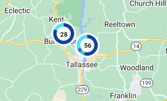
- Click a cluster to reveal the pinpoints within the cluster and the street location for the pinpoints.

- Click a pinpoint to reveal account data for the endpoint.

